- Knowledge Base
- Audience
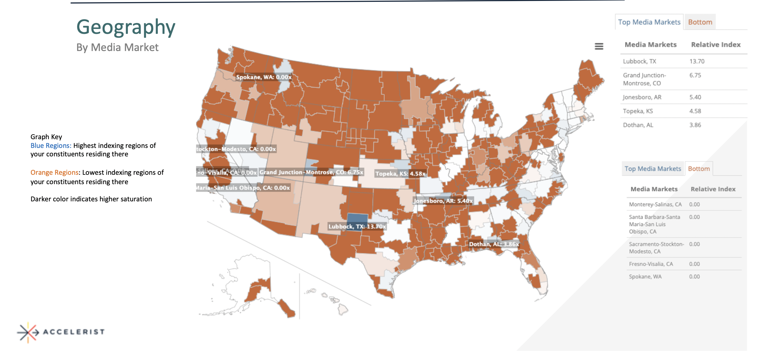
Geographic Map Analysis
What is this map all about?
Ahh yes the geographical map -- its showing you more than just the united states and some colors, let me explain. This map compares your constituency geographics to the geographics of the average nonprofit constituency. Areas that are blue indicate an over-index, meaning more of your constituents reside in these areas than average, and areas that are red indicate an under-index, meaning less than your constituents reside in these areas than average.